
Liberkeys
Accessibility as a driver of desirability.
Accessibility as a driver of desirability.
Accessibility as a driver of desirability.
SaaS B2E, B2B & B2C
Context
Context
SaaS B2E, B2B & B2C
SaaS B2E, B2B & B2C
As Liberkeys prepares to bring its SaaS to market, it faces two major transformations.
The gradual ageing of its user base, both B2B and B2C, makes accessibility a key design challenge.
Major market transformations, notably the rise in
As Liberkeys prepares to bring its SaaS to market, it faces two major transformations.
The gradual ageing of its user base, both B2B and B2C, makes accessibility a key design challenge.
Major market transformations, notably the rise in interest rates, demand a more data-driven approach to prospecting and acquisition.
Improving service accessibility and future-proofing the design system emerge as unavoidable steps to enable a confident and scalable go-to-market
interest rates, demand a more data-driven approach to prospecting and acquisition.
Improving service accessibility and future-proofing the design system emerge as unavoidable steps to enable a confident and scalable go-to-market.
My role
Solo Product Designer
Solo Product Designer
I supported Liberkeys in redesigning and future-proofing its SaaS by turning accessibility constraints and market shifts into a driver of product desirability and adoption.
I supported Liberkeys in redesigning and future-proofing its SaaS by turning accessibility constraints and market shifts into a driver of product desirability and adoption. My responsibilities included:
Led UX strategy and discovery
Owned accessibility-driven redesign
Structured and scaled the design system
Bridged product, design, and engineering
I supported Liberkeys in redesigning and future-proofing its SaaS by turning accessibility constraints and market shifts into a driver of product desirability and adoption.
My responsibilities included:
Led UX strategy and discovery
Owned accessibility-driven redesign
Structured and scaled the design system
Bridged product, design, and engineering
My responsibilities included:
Led UX strategy and discovery
Owned accessibility-driven redesign
Structured and scaled the design system
Bridged product, design, and engineering
I joined in a context where collaboration between product, design, and engineering was very limited. The team needed a system that could be used autonomously without ongoing design support.
I did this rework in a context where collaboration between product, design, and engineering was very limited. The team needed a system that could be used autonomously without ongoing design support.
I did this rework in a context where collaboration between product, design, and engineering was very limited. The team needed a system that could be used autonomously without ongoing design support.
Objectives
Improve overall accessibility as a scalable product and business lever
Objectives
Improve overall accessibility as a scalable product and business lever
Objectives
Improve overall accessibility as a scalable product and business lever
Achievements
Creation of Dome Frames, a comprehensive system that prepared the product for data-driven and gamified evolutions
Achievements
Creation of Dome Frames, a comprehensive system that prepared the product for data-driven and gamified evolutions
Achievements
Creation of Dome Frames, a comprehensive system that prepared the product for data-driven and gamified evolutions
Impact
Established a scalable foundation for future product evolution and improve accessibility and usability standards
Impact
Established a scalable foundation for future product evolution and improve accessibility and usability standards
Impact
Established a scalable foundation for future product evolution and improve accessibility and usability standards
Use Case
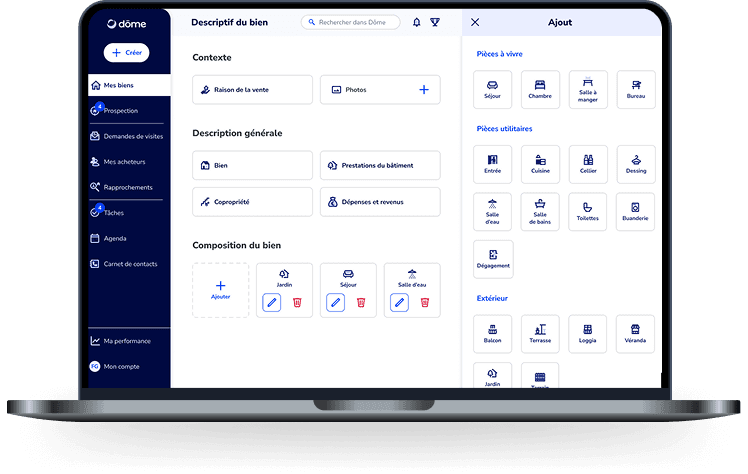
Using depth and contrast to make complexity readable
Using depth and contrast to make complexity readable
Using depth and contrast to make complexity readable
In a product where agents manipulate large volumes of data under time pressure, clarity is not a nice-to-have. It directly impacts efficiency and decision-making.
In a product where agents manipulate large volumes of data under time pressure, clarity is not a nice-to-have. It directly impacts efficiency and decision-making.
Challenge
The team needed a system that could be used autonomously without ongoing design support. The challenge was to create a design system that would:
Be robust enough to scale without a dedicated designer
Be usable by product managers and developers independently
Improve accessibility and usability across the product
Problem
The product suffered from increasing complexity and poor accessibility, making key workflows difficult to use. Early analysis of product data and user behavior revealed significant friction in navigation and task completion.
The product suffered from increasing complexity and poor accessibility, making key workflows difficult to use. Early analysis of product data and user behavior revealed significant friction in navigation and task completion.
Approach
I chose to use accessibility as a leverage point, prioritizing contrast, hierarchy, and consistency over adding new features.
I led the redesign of the design system from the ground up, introducing clearer hierarchy, consistent patterns, and scalable foundations.
I took a system-first approach, rebuilding the design foundations from the ground up:
Defined design tokens (colors, typography, spacing) with accessibility as a core principle
Created a comprehensive component system
Established UX writing and interaction guidelines
Documented all patterns to ensure usability without design support
Execution
Over 3.5 months, I:
Audit existing UI and inconsistencies
Rebuild the design system from previous versions
Structure documentation for non-design stakeholders
Enable handover to product and engineering teams
Over 3.5 months, I:
Audit existing UI and inconsistencies
Rebuild the design system from previous versions
Structure documentation for non-design stakeholders
Enable handover to product and engineering teams
Over 3.5 months, I:
Audit existing UI and inconsistencies
Rebuild the design system from previous versions
Structure documentation for non-design stakeholders
Enable handover to product and engineering teams
Results
The design system was adopted by the team before my departure, becoming the foundation for ongoing product development without dedicated design support. Product and engineering teams were able to use the system autonomously, validating its clarity and usability.
The design system was adopted by the team before my departure, becoming the foundation for ongoing product development without dedicated design support. Product and engineering teams were able to use the system autonomously, validating its clarity and usability.
Instant hierarchy for faster decisions
With explicit controls and high-contrast visual cues
Key information, always within reach
Designed for mobile use in the field
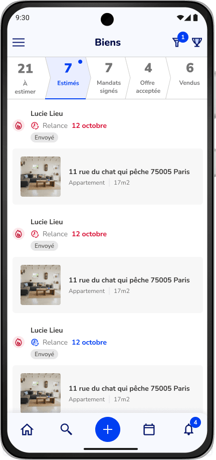
By reinforcing visual hierarchy through depth, contrast, and intentional color usage, the interface was redesigned to surface what matters most at each step. The result: faster scanning, clearer priorities, and reduced cognitive load across complex workflows.
By reinforcing visual hierarchy through depth, contrast, and intentional color usage, the interface was redesigned to surface what matters most at each step. The result: faster scanning, clearer priorities, and reduced cognitive load across complex workflows.
Want to
Know more ?
Previous works
Complex products, real constraints,
measurable impact.
Complex products, real constraints,
measurable impact.


I’d like to get to know you.
Got a project in mind?
Got a project in mind?
Let’s talk.
Email:
angela.seraille@gmail.com
I’d like to get to know you.
Got a project in mind?
Let’s talk.
Email:
angela.seraille@gmail.com
Previous works
Here’s a selection of various past projects
across different indutries.